Responsive UI
So you plan to develop your game for PC first, then the second version will be available on phones… and a few months later, as the game is very successful (we hope so!), we will talk about TV boxes and consoles.
How many times do you plan to rework your User Interface?
For most cases (not all) we think a good interface could work on the majority of device families.
A good interface should be responsive.
The basics are quite simple: the interface should adapt its layout according to some criterions:
- The screen size
- The screen aspect ratio
- The device family
At Asmodee Digital we speak about Small, Regular and Big display modes to define our interfaces.
- Usually Small refers to phones, or small tabs (but it works well for TVs)
- Regular is usually used from 9” tabs to 15,4” laptops
- Big is only seen for desktop computers with big screens.
Preferences
The helper class Preferences is a first attempt to give a common definition in the SDK. It is accessible throw the CoreApplication component.
Preferences preferences = CoreApplication.Instance.Preferences;
It offers several properties like:
InterfaceOrientation{ Horizontal, Vertical }DisplayMode{ Small, Regular, Big }Aspect(the window aspect ratio)
You can also register for runtime updates.
What should you do?
Internally it’s up to you to choose how to best handle the situation. Every game and user interface is different.
- Maybe you just have to scale up/down some elements according to the context
- Or more complex, you may activate/deactivate on the fly large parts of your UI, design and switch prefabs per display mode …
Editor
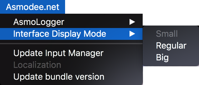
In order to help with scene design, the Asmodee.net > Interface Display Mode menu could be useful.
ResponsivePopUp
As an example, ResponsivePopUp is our solution to display dialog boxes. It is used in the SSO and AlertController prefabs.
This component will apply a strategy to the container of the dialog box. It can apply a different scale according to the display mode. Generally on a phone we will try to cover the major part of the screen (like 90%) and on a 27” desktop screen, we prefer a smaller visual footprint (like 40%).
The content of the dialog box is simply scaled thanks to its container… nothing more.
